Unshackled Ventures
About the project
Timeline:
Jul - Aug 2025
Skills:
Web Design
Tools:
Webflow
Figma
Project Details
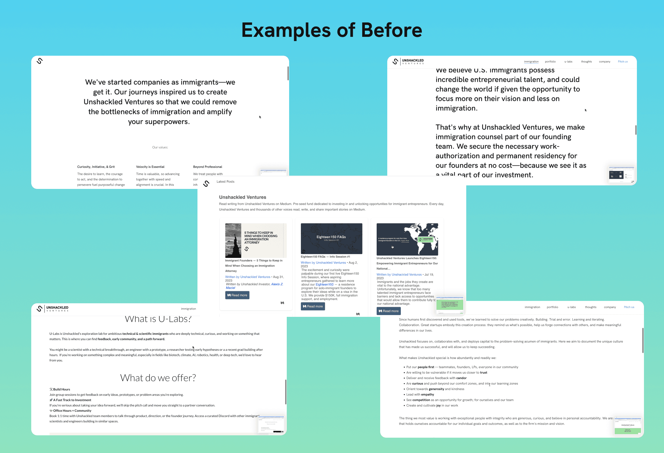
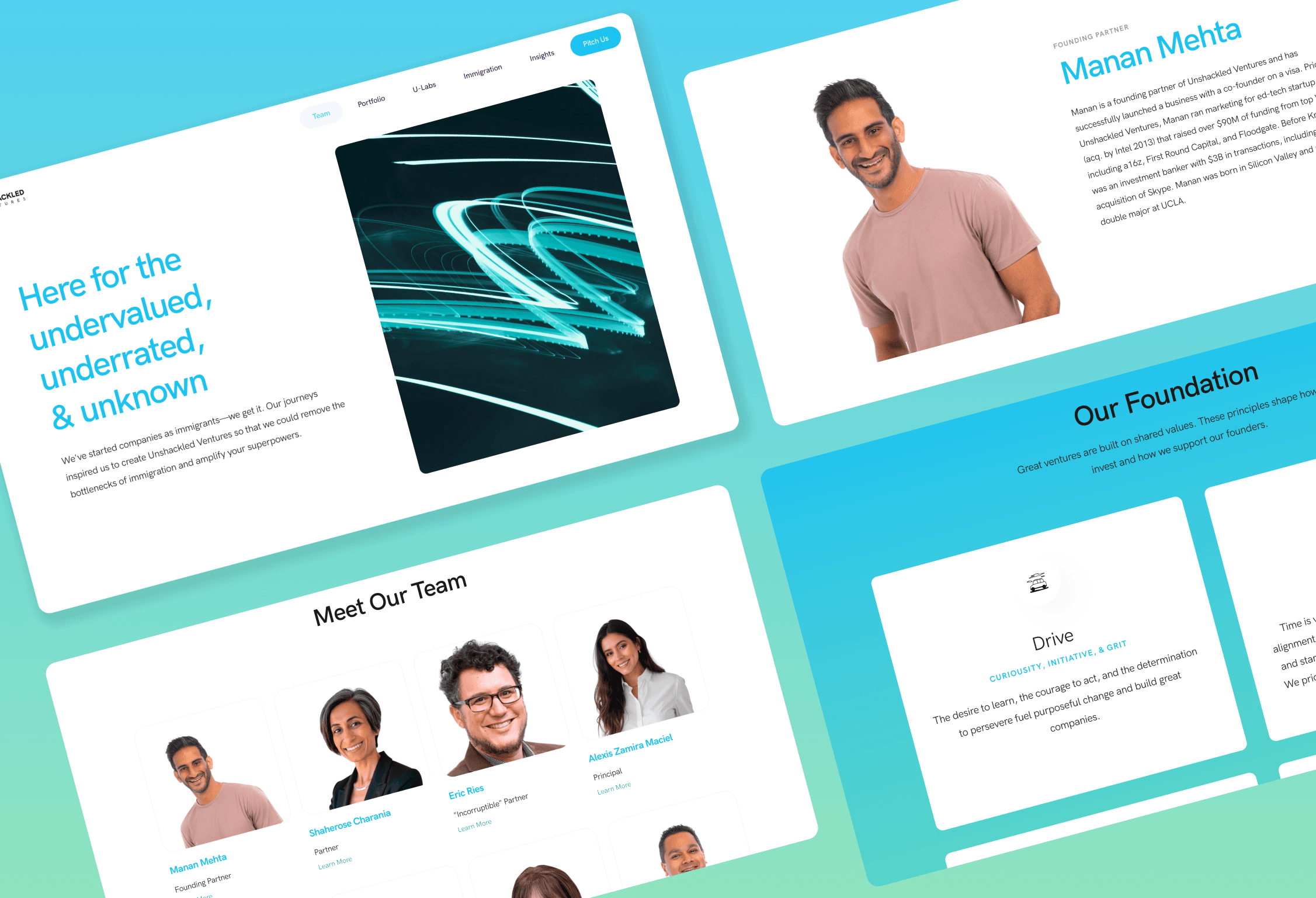
Unshackled Ventures' website had two problems: their website spoke to investors when they wanted to recruit founders, and a decade of accumulated content had created an inconsistent, text-heavy experience that made it hard for anyone to find what they needed.
The issues ran deep. Inconsistent typography, different fonts, sizes, capitalizations, and colors across pages. Overwhelming content with no visual hierarchy or breathing room. A portfolio page that forced users to scroll through every company with no way to filter. An FAQ section organized by category but requiring endless scrolling to find the right one. Outdated pages that no longer served the business. A backend cluttered with unused CMS collections. My mission was to fix all of the usability issues and clean up the look of the website.
Liz was amazing to work with. The project’s goal was to redesign our firm’s website in order to convey our message better to our founders & investors. She did a great job asking for key information such as company values and brand positioning to inform her design strategy. She kept an iterative process, communicating with decision-makers transparently and making sure that we all were aware of how the design was going.
Fernanda
Data Analyst
Things I Did
I started with a comprehensive audit to identify where messaging misaligned with their founder-first mission and where the UX was fundamentally broken. Then I got to work restructuring.
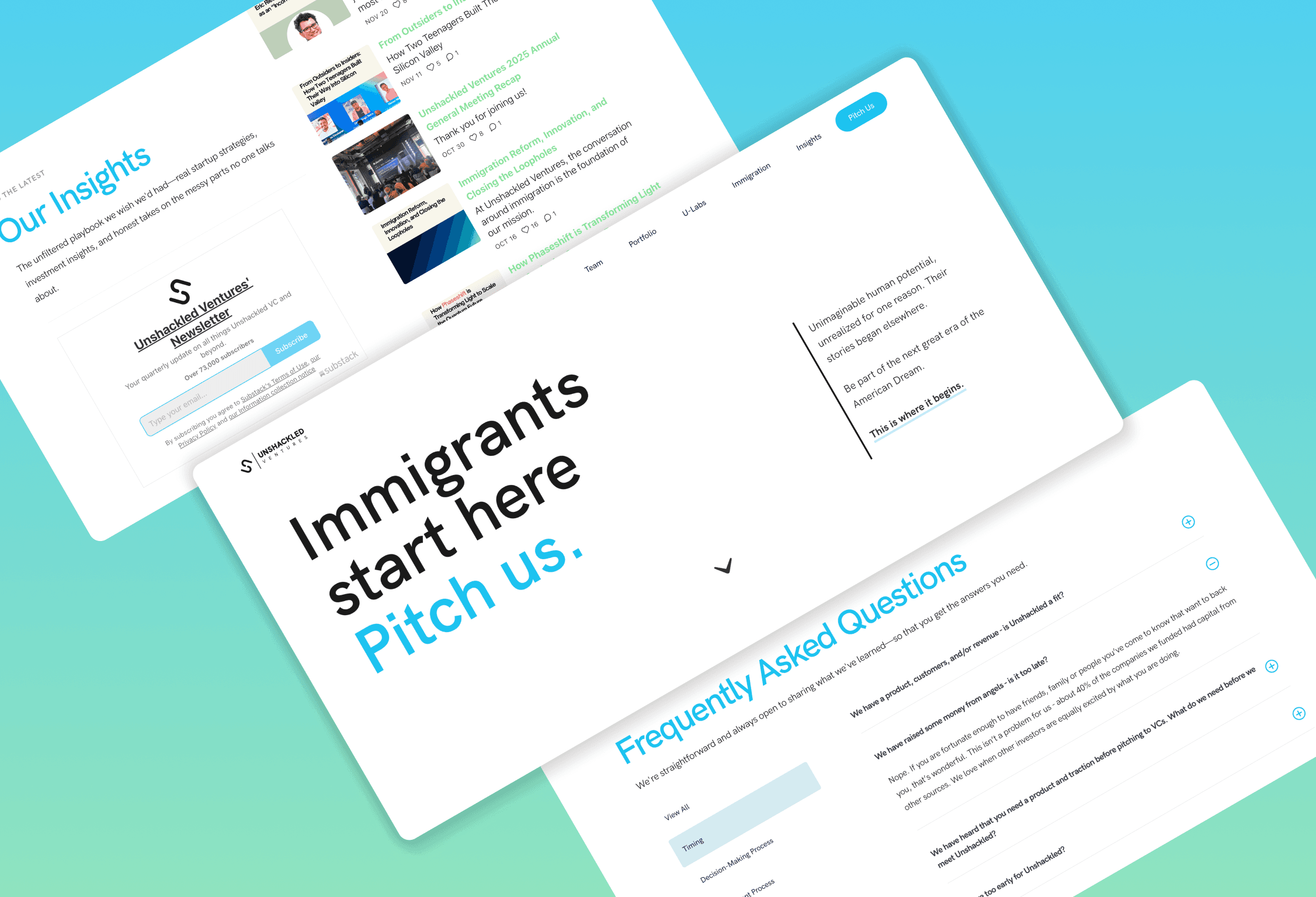
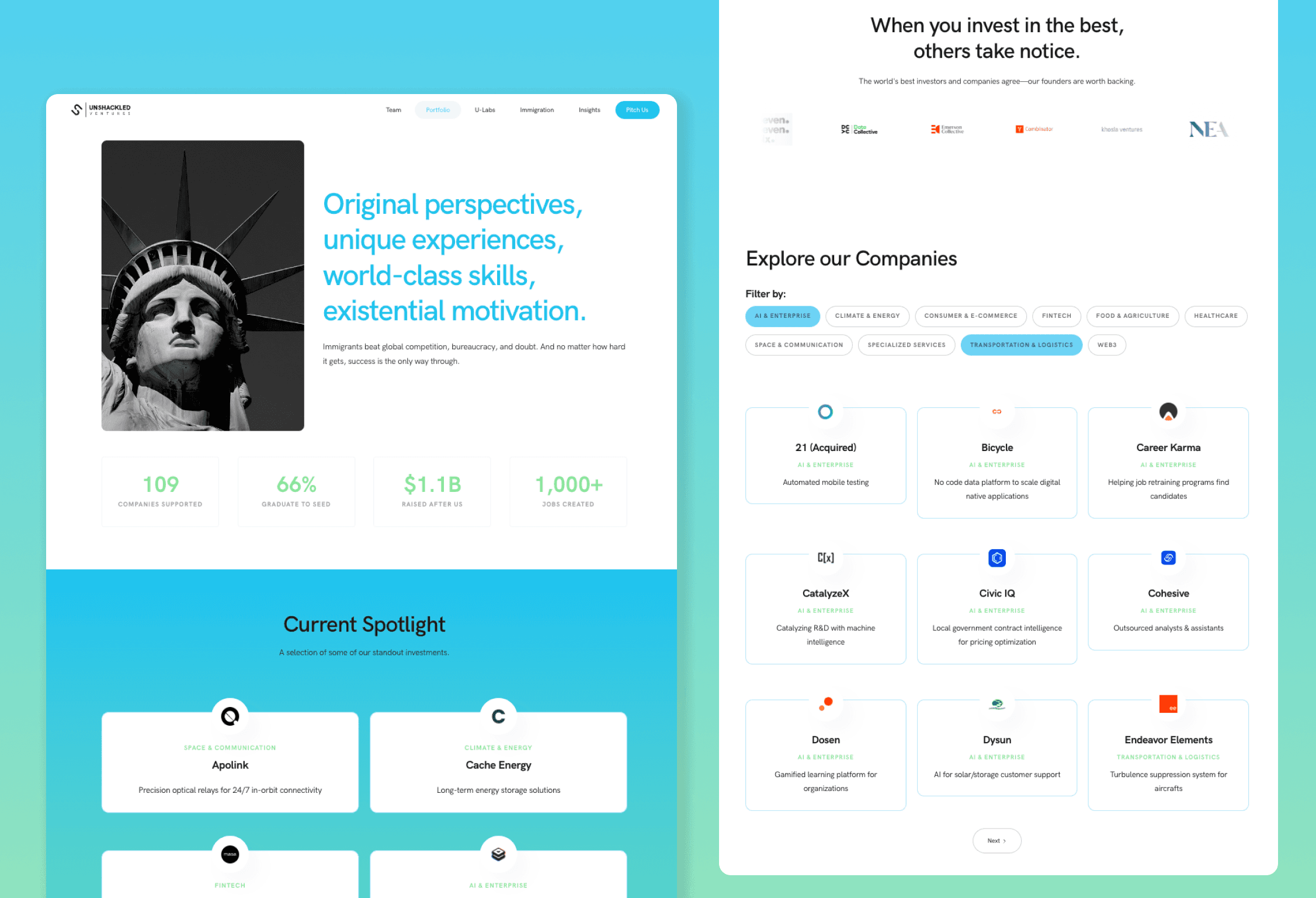
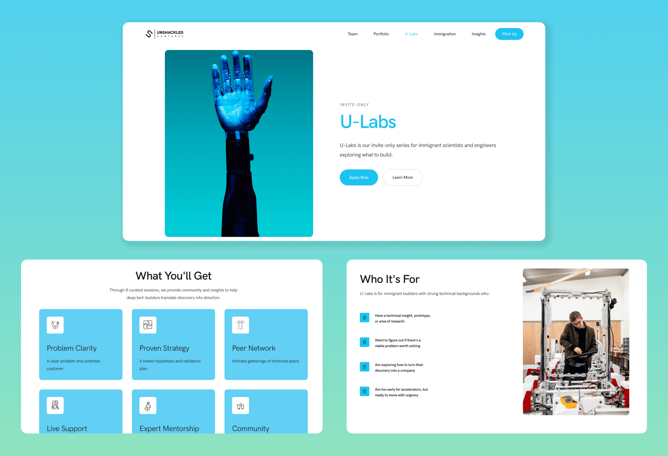
For the portfolio, I added pagination and industry filters so users could actually navigate their companies. For the FAQ, I implemented a tabbed side menu letting users view all questions or jump to specific topics. I cleaned up typography across all pages, establishing consistent hierarchy and spacing. I redistributed content to pages where it actually belonged, removed redundant text entirely, and broke long blocks into scannable layouts with relevant imagery and metrics.
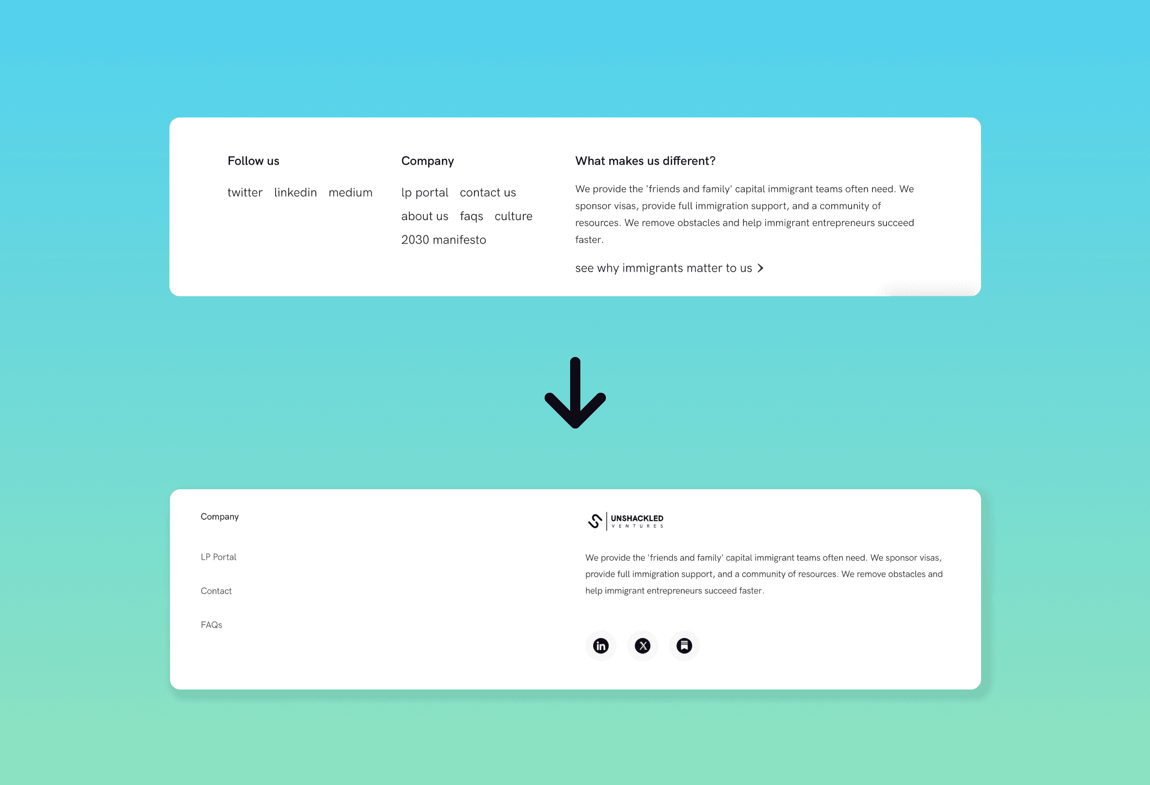
Behind the scenes, I updated CMS collections, removed outdated pages, and streamlined the backend. I redesigned the navigation and footer for clarity and consistency. Every decision prioritized usability over flash. The goal wasn't to win awards, but to create a functional, founder-focused experience that actually worked.
