DayU
About the project
Timeline:
Feb - May 2024; Jan 2025
Skills:
UI/UX
Mobile Design
Tools:
Figma
Adobe Illustrator

Project Details
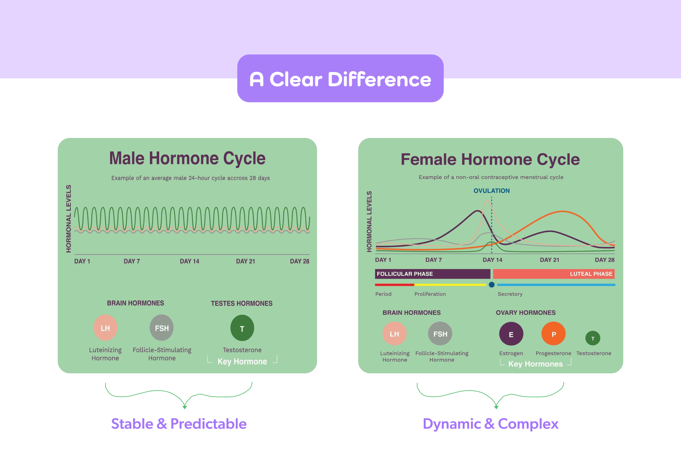
Most productivity apps assume everyone's energy stays constant. But 92% of women in our research confirmed that hormonal fluctuations significantly impact their ability to get things done, and not a single productivity tool on the market addressed this.
I led the design for DayU from brand strategy through prototype, working with a product marketing manager and technical PM. We started with extensive research: surveying 194 people, reviewing 20+ peer-reviewed studies, and analyzing 15+ competitor apps to confirm the market gap.
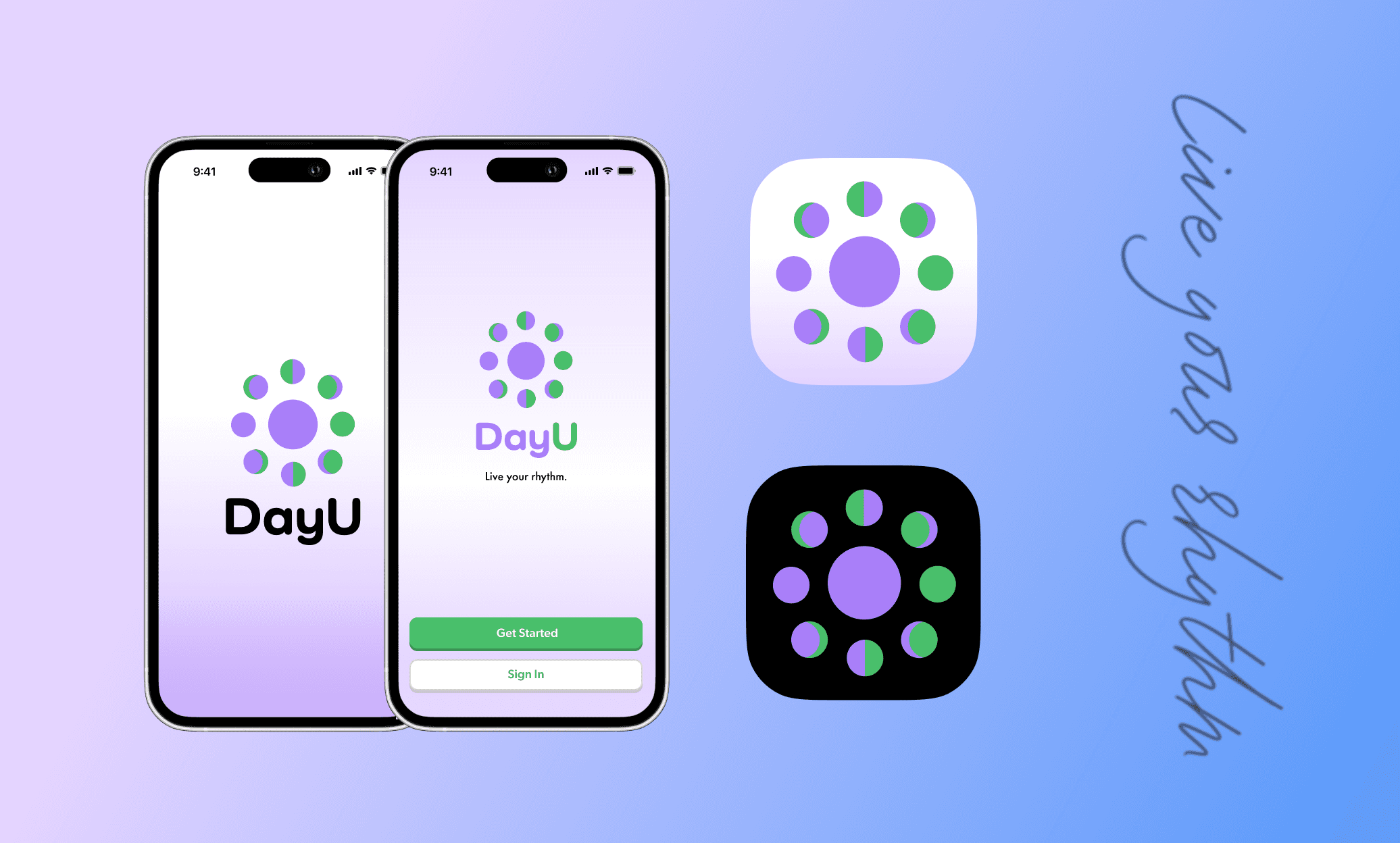
The design challenge was creating something that felt trustworthy enough for health data but visually engaging for Gen Z and Millennial women. Through color psychology research and iterative testing, I developed a brand identity using purple (creativity), green (wellness), and blue (trust), blending 90s nostalgia with modern sophistication.
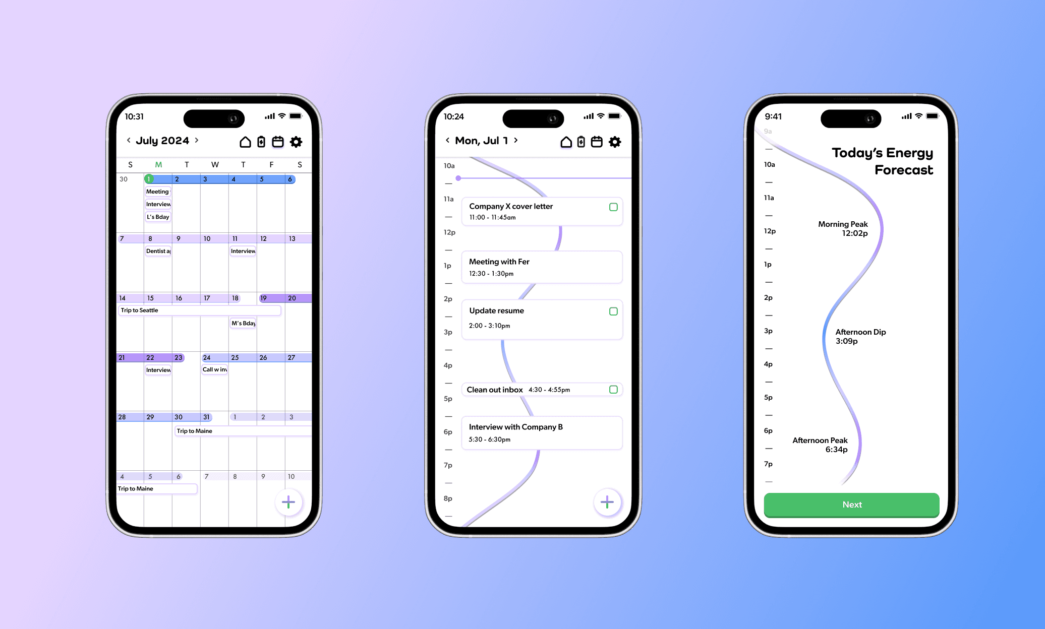
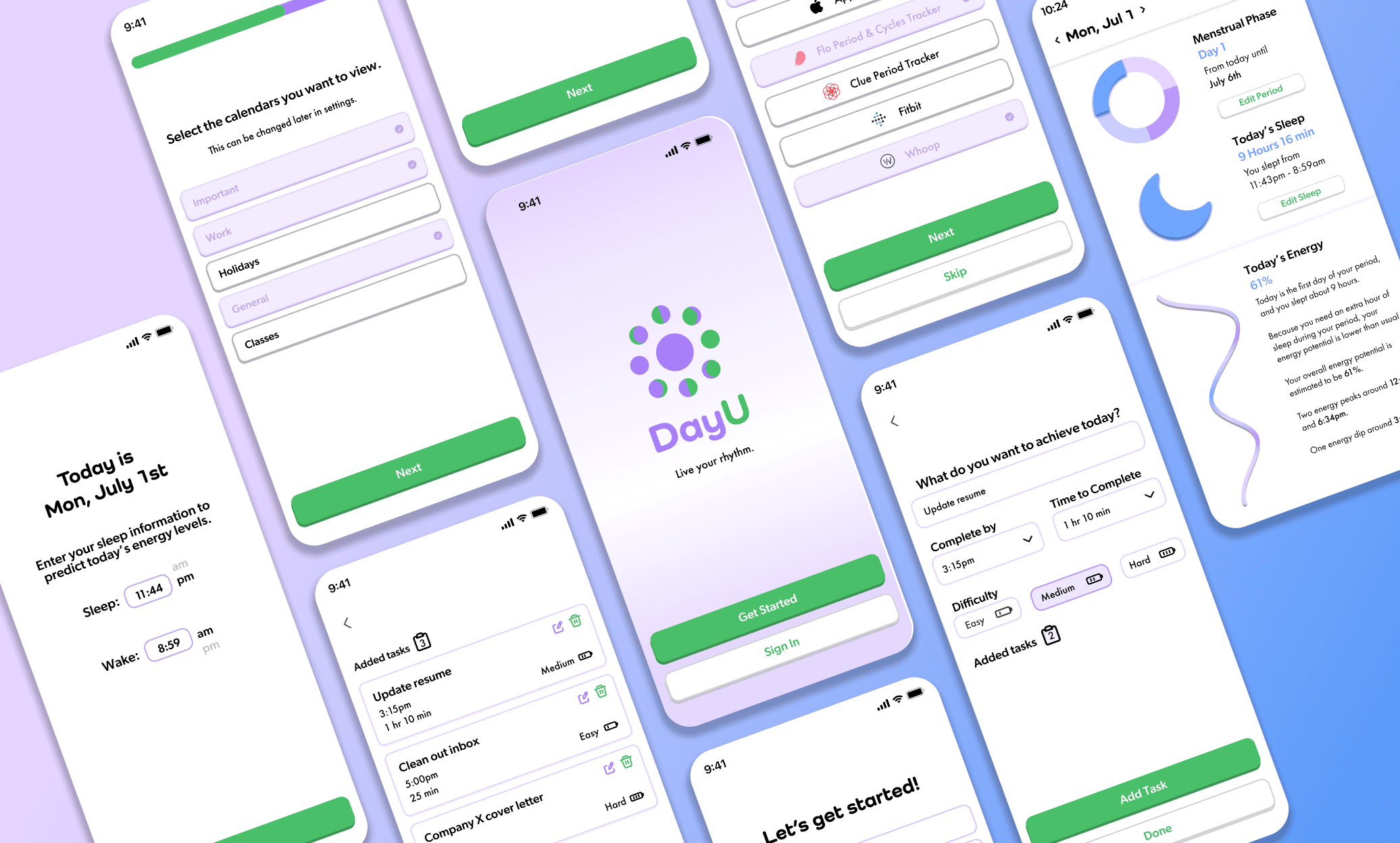
Initial usability testing showed a 65% task completion rate with users struggling to navigate. I simplified the information architecture, reduced task creation from 4 steps to 2, and improved visual hierarchy. Final testing achieved 95% completion and 4.7/5 satisfaction, a complete turnaround.
Liz was incredibly dedicated throughout this project, basically working nonstop to get everything done. She took all my marketing research and brand direction and turned it into actual designs that made sense for our audience. When we needed a pitch deck last minute before the competition, she just made it happen. What made working with her great was how clearly she explained her design decisions and how well she took feedback. Couldn't have done it without her.
Sofia
Project Marketing Manager
Things I Did
I led visual identity design, UI/UX, and creative direction for the entire project. This included conducting user research with 194 participants, designing 50+ branded assets, creating the complete interface in Figma, building a functional FlutterFlow prototype, and running iterative usability tests that improved task completion by 30%. I also developed the brand strategy based on color psychology research and Gen Z design preferences, ensuring every design decision was grounded in data.