Hard Tellin' Coffee Co.
About the project
Timeline:
Sept - Nov 2025
Skills:
Web Design
Front-End Dev
Branding
Tools:
Figma
HTML/CSS
Javascript
Project Details
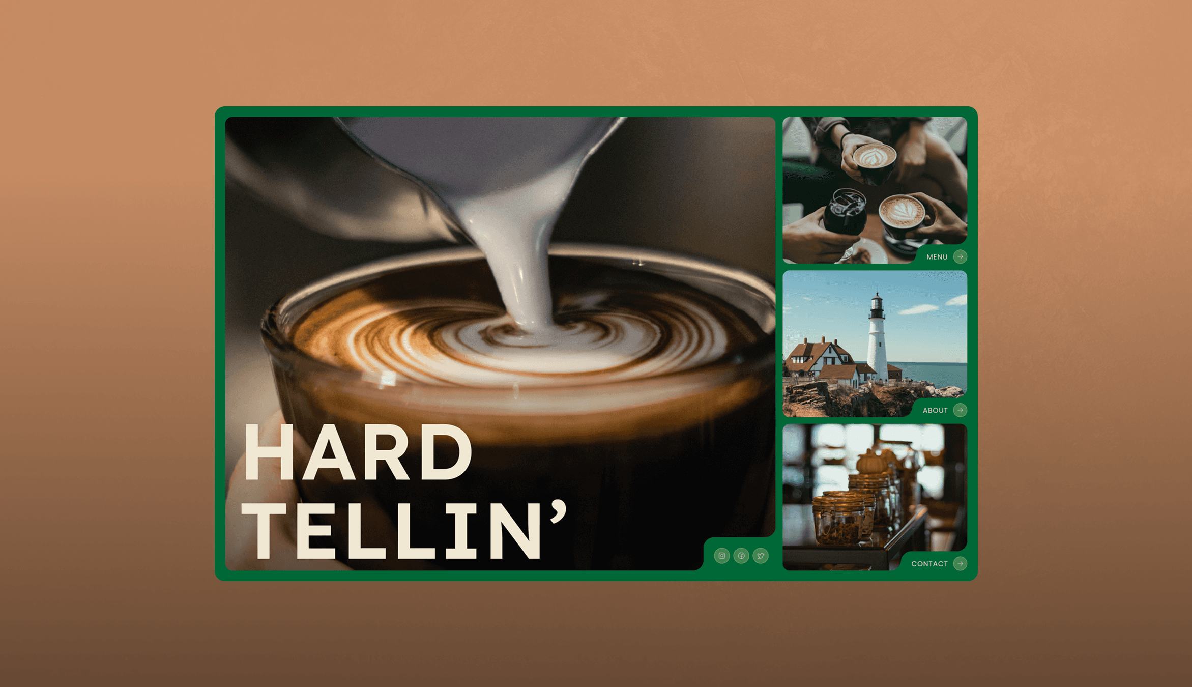
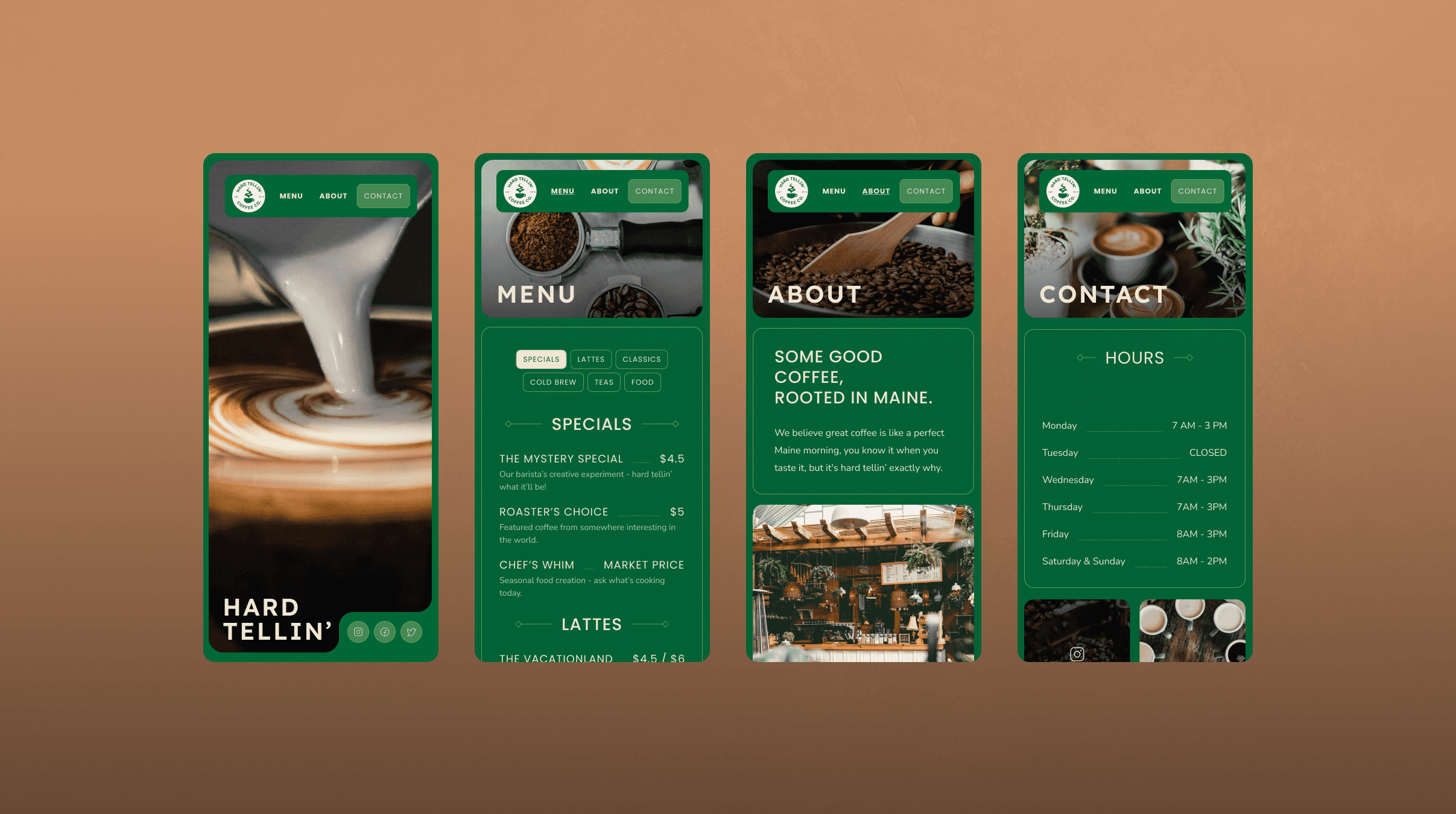
What started as a simple coding assignment became an opportunity to practice the full design-to-development pipeline. I created Hard Tellin' Coffee Co., a fictional Maine coffee roastery that embodies the state's philosophy of quiet excellence and dry humor.
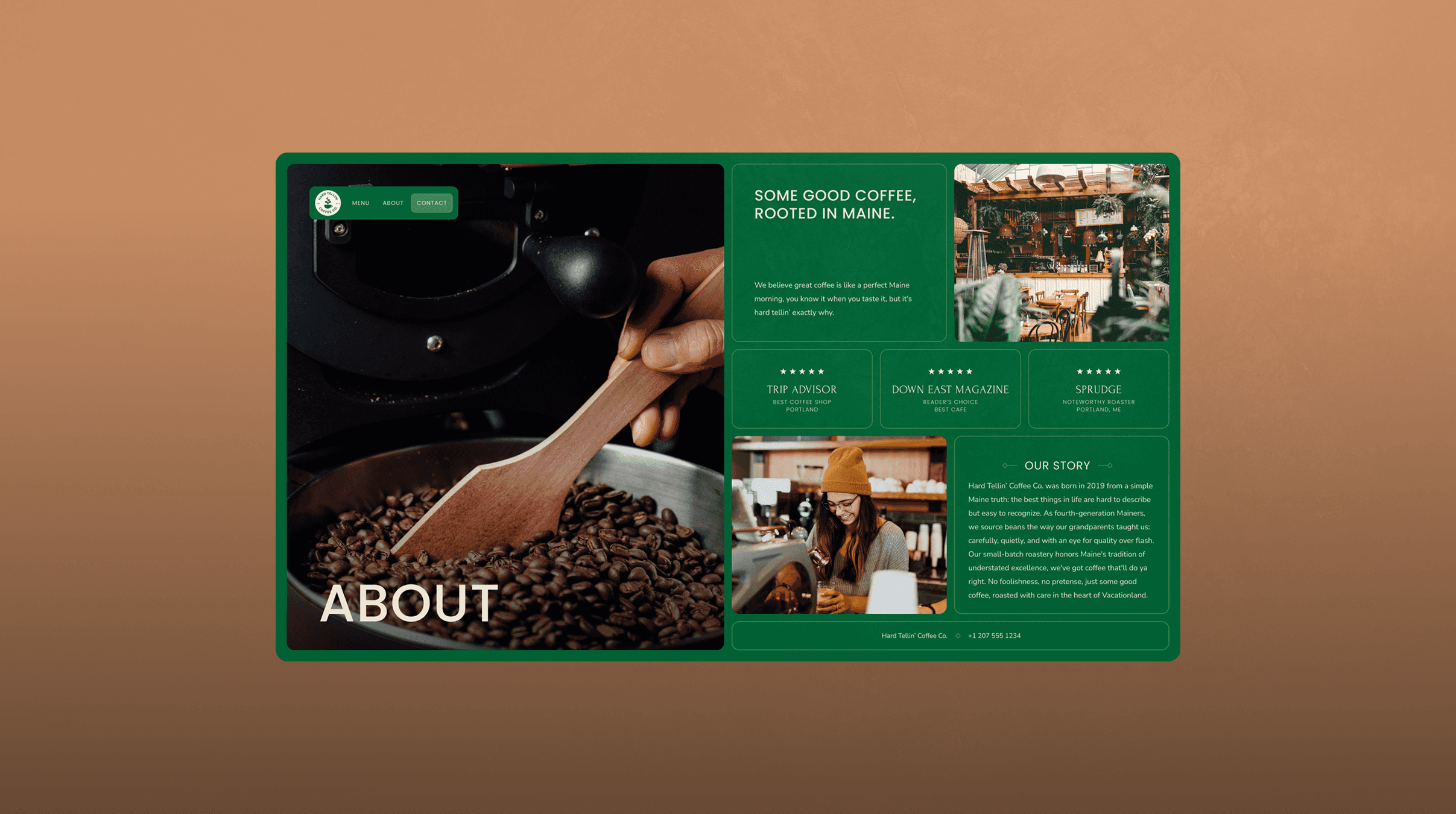
The brand strategy came first: 'Hard tellin' how good it is until you try it.' This became the foundation for everything—understated confidence, subtle Maine wit, and a focus on quality over flash. I designed a logo featuring a coffee cup with steam rising in the shape of a pine tree, developed a color palette inspired by Maine's natural landscape, and established typography that balanced rugged authenticity with clean readability.
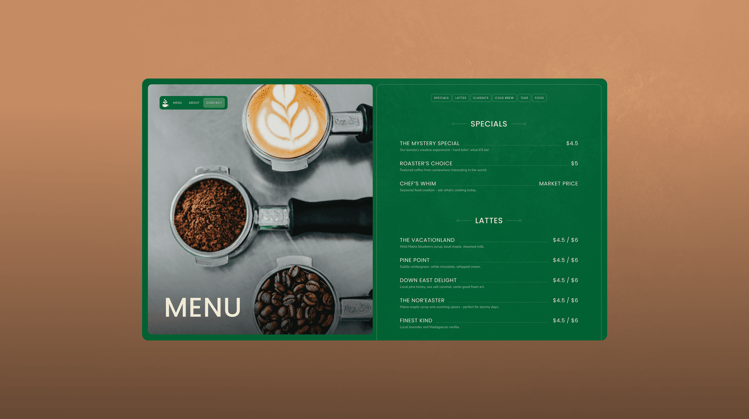
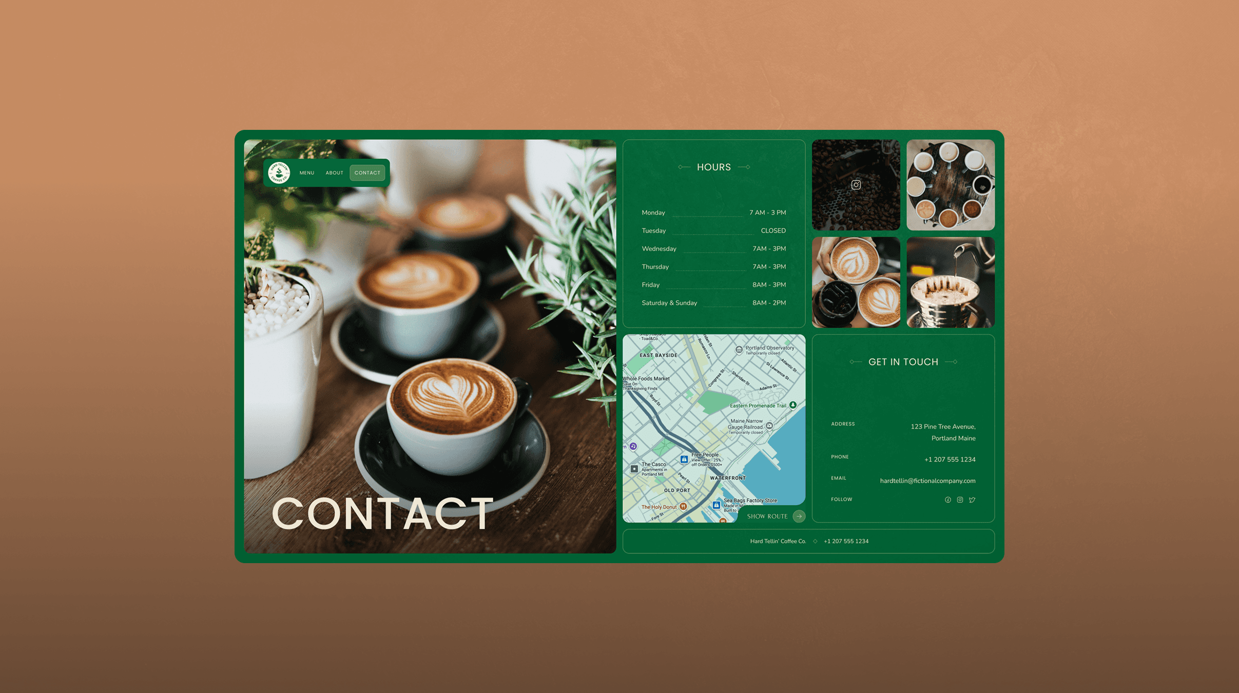
The UX reflected the brand's no-nonsense approach: simple navigation, clear hierarchy, no unnecessary features. Just enter and click where you're going, matching the 'no foolishness' ethos.
But building it from scratch taught me something crucial: beautiful designs don't always translate easily to code. My original mockups had to evolve as I learned what was actually feasible to implement responsively. Some layout ideas that looked perfect in Figma became complicated nightmares in CSS. This process gave me deep appreciation for developers and taught me to design with technical constraints in mind.
Designing is hard, coding it is even harder.
Things I Did
Complete brand strategy including voice, tone, and messaging guidelines. Logo design with multiple variations. Color palette and typography system. UI/UX design for 4 pages (home, about, menu, contact). Front-end development using HTML, CSS, and JavaScript with responsive design considerations. Iterative redesign based on technical implementation constraints